Going for a walk with letterforms
When a graphic designer observes typography in Wichita, the city becomes an ever-changing exhibition space.
Letterforms on the streets have a life of their own. Sometimes they are efficient and matter-of-fact, sometimes expressive and insistent. Carefully chosen and crafted by designers, once these forms leave the creative studio they begin a journey of their own. They fade, erode, flicker, and accumulate new layers of meaning.
In his book “The Art of Noticing,” Rob Walker points out that our ability to notice is often lost in this age of constant distraction. In other words, our attention is not fully our own. A walk around town can be a way to reclaim our attention. Furthermore, a walk with letterforms can be a way to establish new relationships with your city through observation.
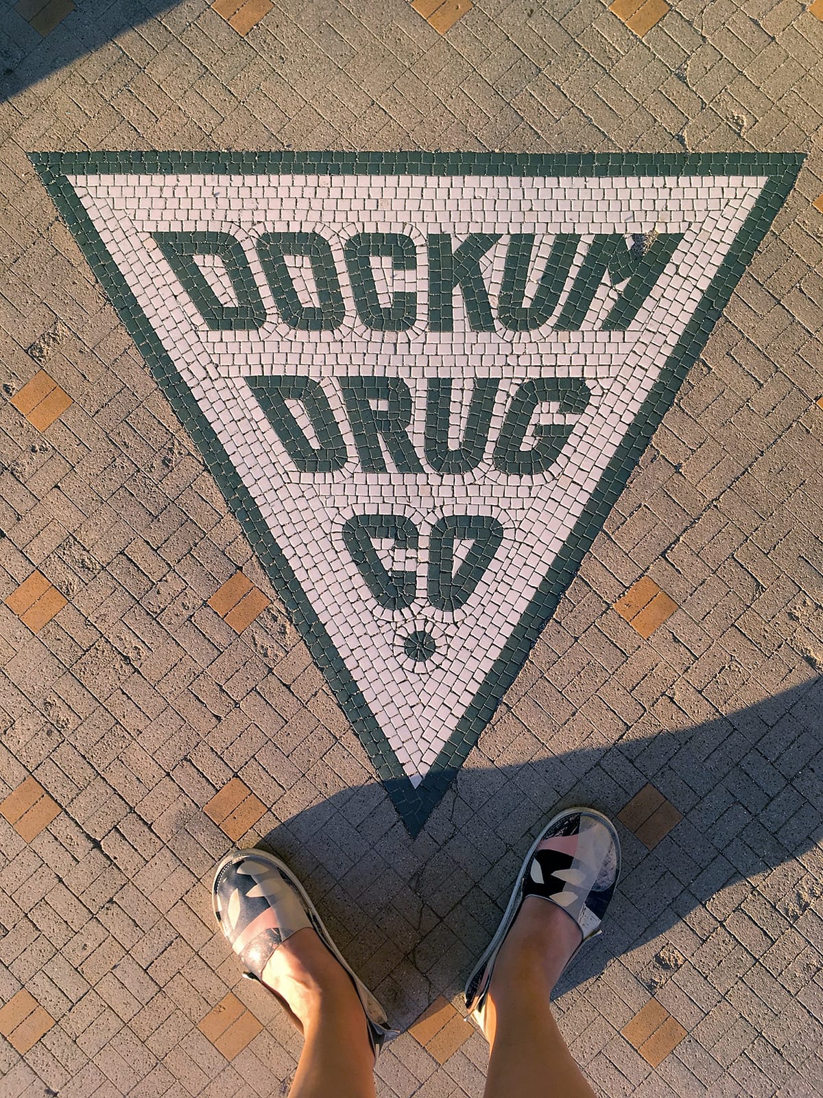
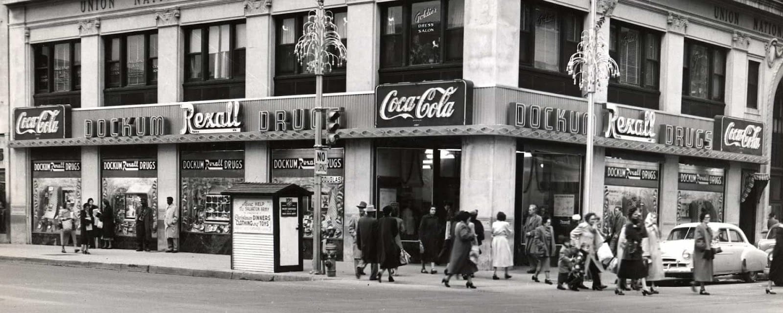
Over the years, I have collected photographs of letterforms across urban landscapes on my travels and in the places I’ve lived. One of the first pieces I photographed after arriving in Wichita was the tile lettering of Dockum Drug Co. It was late in the summer, the sun already low and spotlighting the floor signage, giving it a warm light overcoating. The suggestive, reversed triangle seemed to nudge me: take my photo. I later shared the image with a colleague and learned that Dockum Drug Store. was an important historic site in the U.S. Civil Rights Movement.
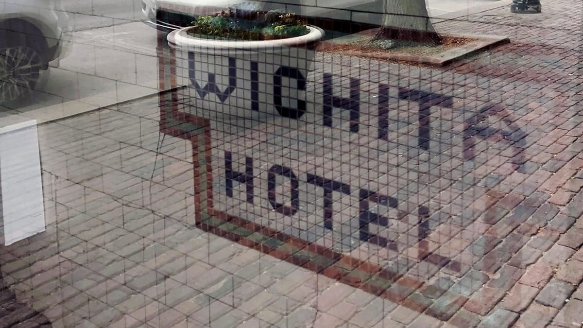
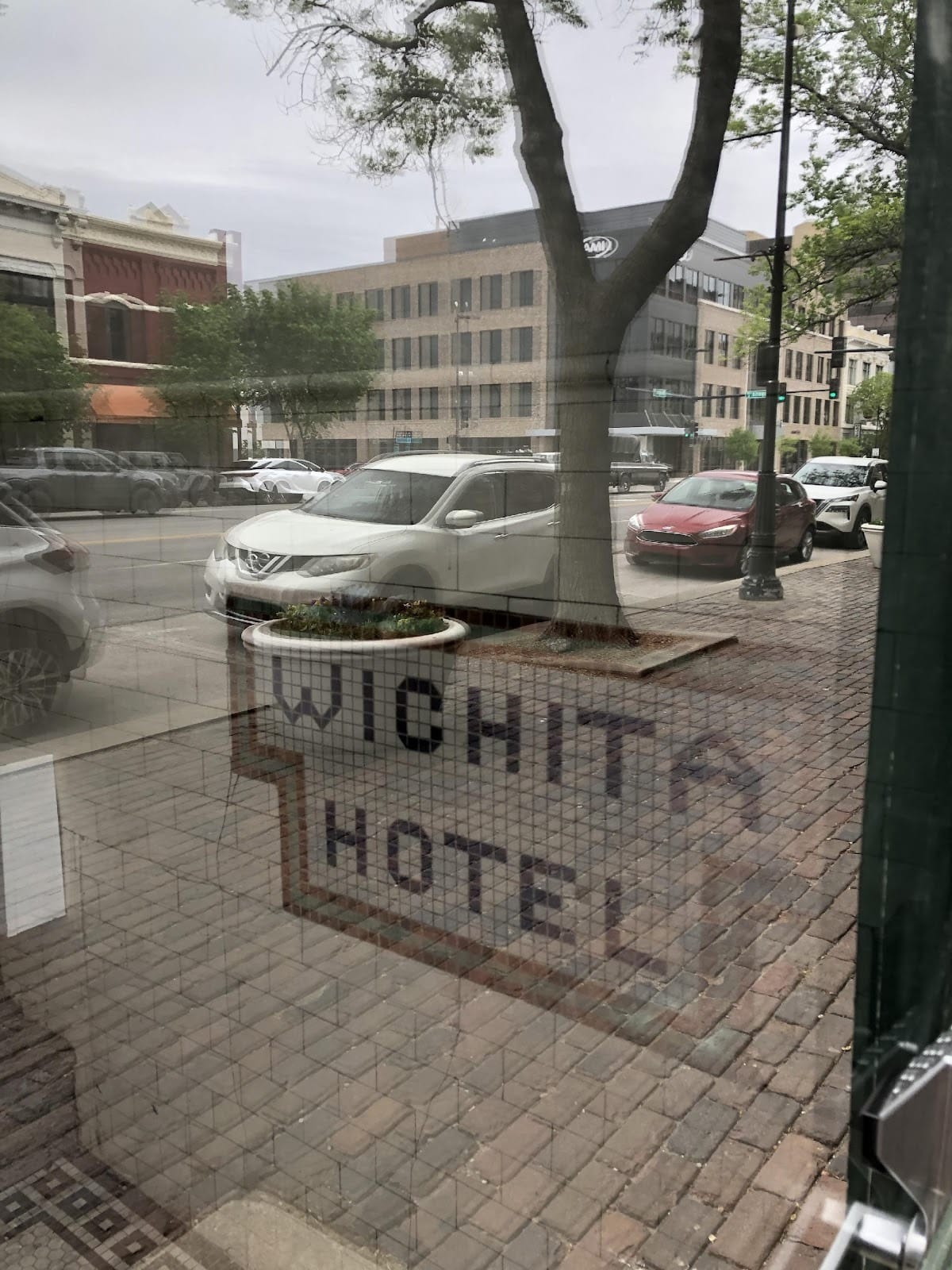
One afternoon, standing inside a downtown building, I caught a reflection that I almost missed. While the image itself doesn’t hold extensive aesthetic interest, it has a place in my visual diary. I must admit, floor-tiled lettering was a new phenomenon for me, coming from urban spaces where this practice is not common. As I waited for a friend to arrive, I watched the street through the building’s front door window. Suddenly, the words “Wichita Hotel” hovered over passing traffic. This composition stitched itself together by chance. This quiet encounter with language and visual form, designed by no one, felt like a gift in that fleeting moment.
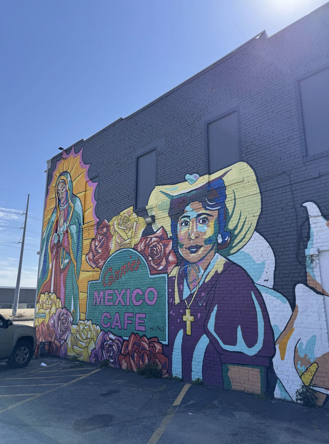
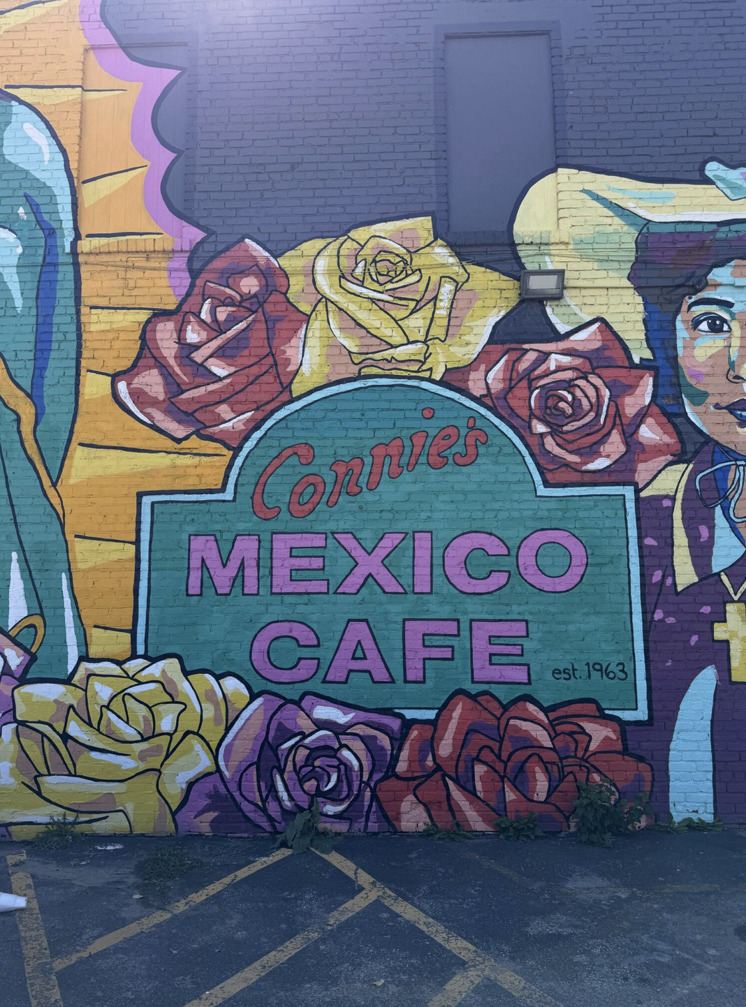
Sometimes I intentionally look for lettering examples that I can show to my students. When I learned that a muralist had painted the building housing Wichita’s long-standing restaurant Connie’s Mexico Café, I biked to the north side of the city to capture it. What struck me was the way the imagery greets the viewer with joy and vibrant energy — echoing Mexican culture through color, illustration, and a depiction of the Virgin Mary — while the lettering felt somewhat static in comparison.
At first, the designer in me noticed its minimal, Euro-centric, sans-serif style. It didn’t carry the same cultural references as the mural’s illustrations and I wondered why. But then I began to see the contrast differently. Perhaps the plainness of the type offers space for projection. The mural sets the stage, and the lettering becomes a kind of wireframe — an open container for the viewer’s own associations. Or perhaps it stands as a bridge between two cultures: Connie’s heritage and the local, commerce-driven signage. In any case, it seems like the mural’s lettering is less about representing Mexico and more about holding a space where community identity can be filled in by each viewer.
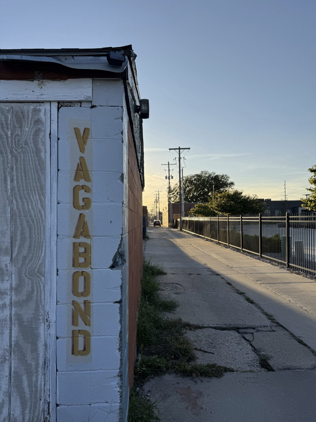
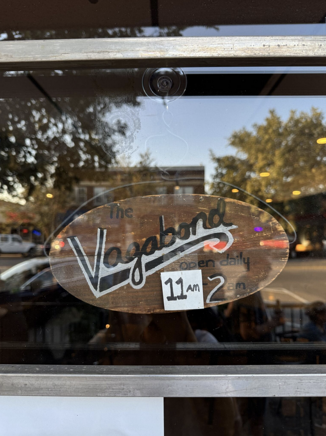
The Vagabond is one of those places that feels like a generous hug. Part coffee shop, part cocktail bar, and part living room, its lettering reflects that generosity — or, at least, that is what comes to mind every time I get lost in its multi-style compositions.
Its front window features an eclectic collection of signage, including the wording “The Vagabond” in a sans-serif style with an outline. On the front door, the name is written with a brush, imitating the old-fashioned style of outdoor advertising or early print ads. Over time, the opening hours changed, and, instead of remaking the sign, the owners simply taped a sheet of paper over it and wrote the new time in marker.
Out back, a bold vertical stencil version of “Vagabond” appears, echoing the kinds of utilitarian building signage painters once made.
At first, I thought The Vagabond letterform collection was inconsistent. But with time, I began to see the disparate lettering as communal. Together, the styles speak in multiple tones, like conversations unfolding in a living room. Their variety suggests a place that is welcoming, adaptable, and open to whoever walks in.
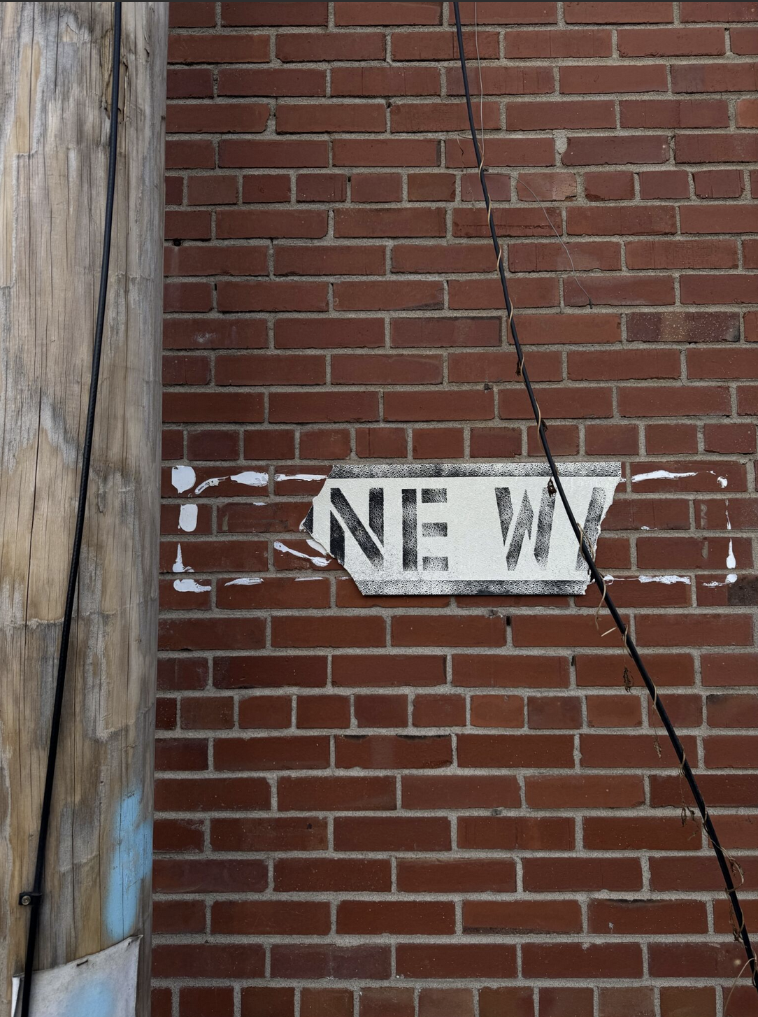
On one city block, I found two small signs that have unintentionally transformed over time. The first is a fragment of a larger sign. The left side had broken away, leaving only the tail of one word “NE,” which happened to line up with the start of another word beginning with “W.” What was once two words had collapsed into one: NEW. The accident created a new meaning. It was as if the city had curated a fresh piece for its gallery wall.
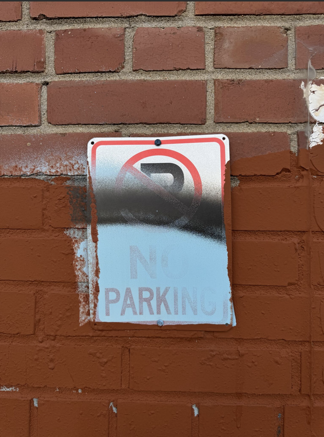
Next to it was a small No Parking plate thickly spray painted to the point where only “PARK” remained most visible. What had once been prohibition now read as permission.
These pieces remind me that the city itself can be an artist using tools and techniques like time, erosion, and accident to create new compositions out of familiar forms.
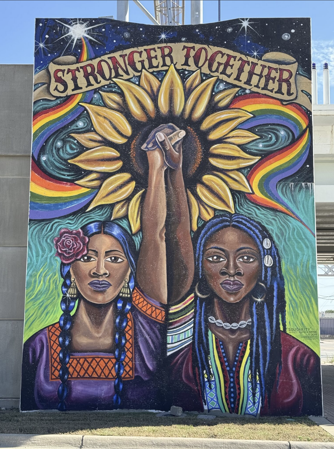
I have been intrigued by “Stronger Together,” Kamela Eaton’s mural for the Horizontes Project, since I first saw it. The image is a burst of bold energy and celebration showcasing women’s strength and voices as they rise in a monument stance. And then there is the type. At first glance, it feels conventionally (U.S.) American: the kind of lettering you see in old advertising posters from the industrial era, in carnival broadsides, and later in tattoo parlors. You could say its DNA is vernacular American display lettering. Why this typeface? I caught myself not criticising this decision, just observing it with the utmost curiosity. Why choose a form so tied to American commerce and spectacle?
And then, in that question, I felt a shift: this is not just a design choice, but a statement. In the context of the Horizontes Project — which seeks to bridge neighborhoods divided by industrial infrastructure in north Wichita and amplify historically marginalized voices — the mural reads as a visual gesture toward place and belonging. Its lettering, which is deeply grounded in American visual history, becomes an argument for resonance and connection.
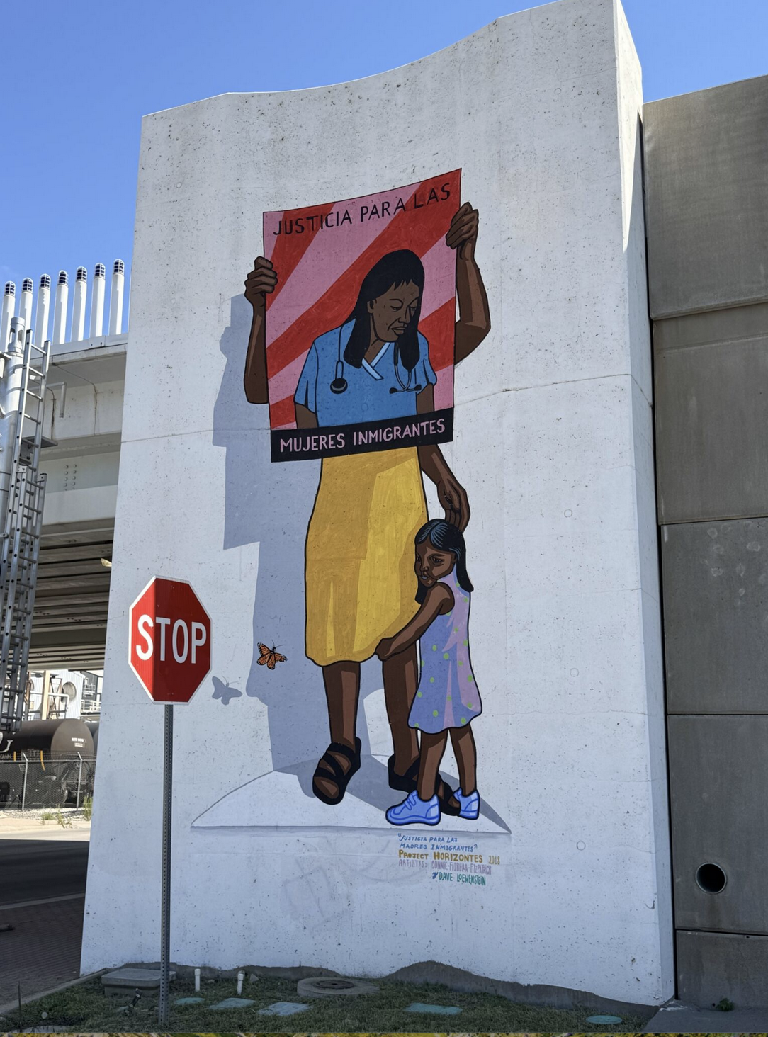
On display next to "Stronger Together" is another bold mural by artists Connie Fiorella Fitzpatrick and Dave Loewenstein titled "Justicia para las mujeres immigrantes (Justice for Immigrant Women)." When I photographed this site, a stop sign stood at the edge of the frame. Sunlight caught only the first letter S, leaving the rest of the letters in shadow. This accidental highlight was not designed or planned by the muralists, but it became part of the composition at that moment.
It reminded me of a point Francesco Careri makes in his book “Walkscapes: Walking as an Aesthetic Practice”: The simple act of walking can transform the meaning of a place. Our perception, our memory, and even a fleeting detail like sunlight on the letter S, all intervene in how space is constructed. Fitzpatrick and Loewenstein painted the mural years ago, and the stop sign was placed without any consideration of the mural, but in that moment, together, they remade the corner for me.
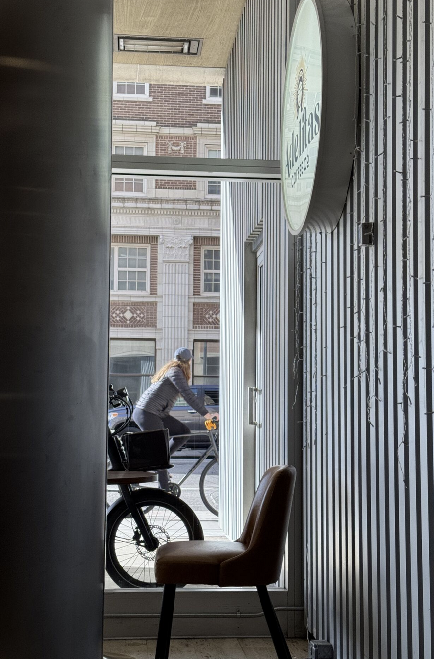
On Saturdays, I often find myself at Adelitas, a local coffee shop I go to for a date with a book. One morning, I took a snapshot from my table — not of the coffee in front of me, but of the view across from me surrounding and through the window. In the frame were layers: the Adelitas logo on the plastic sign board, the glass pane reflecting and refracting the street, the building across the street signaling downtown, and, at just the right moment, a cyclist passing by.
The image became less a record of my time at the coffee shop and more of a portrait of a layered, urban landscape where inside and outside collapsed into one plane. Letterforms, architecture, and movement all became part of a single composition. In this moment, letterforms were not just a logo of recognition for Las Adelitas, but a part of a fleeting collage of city life.
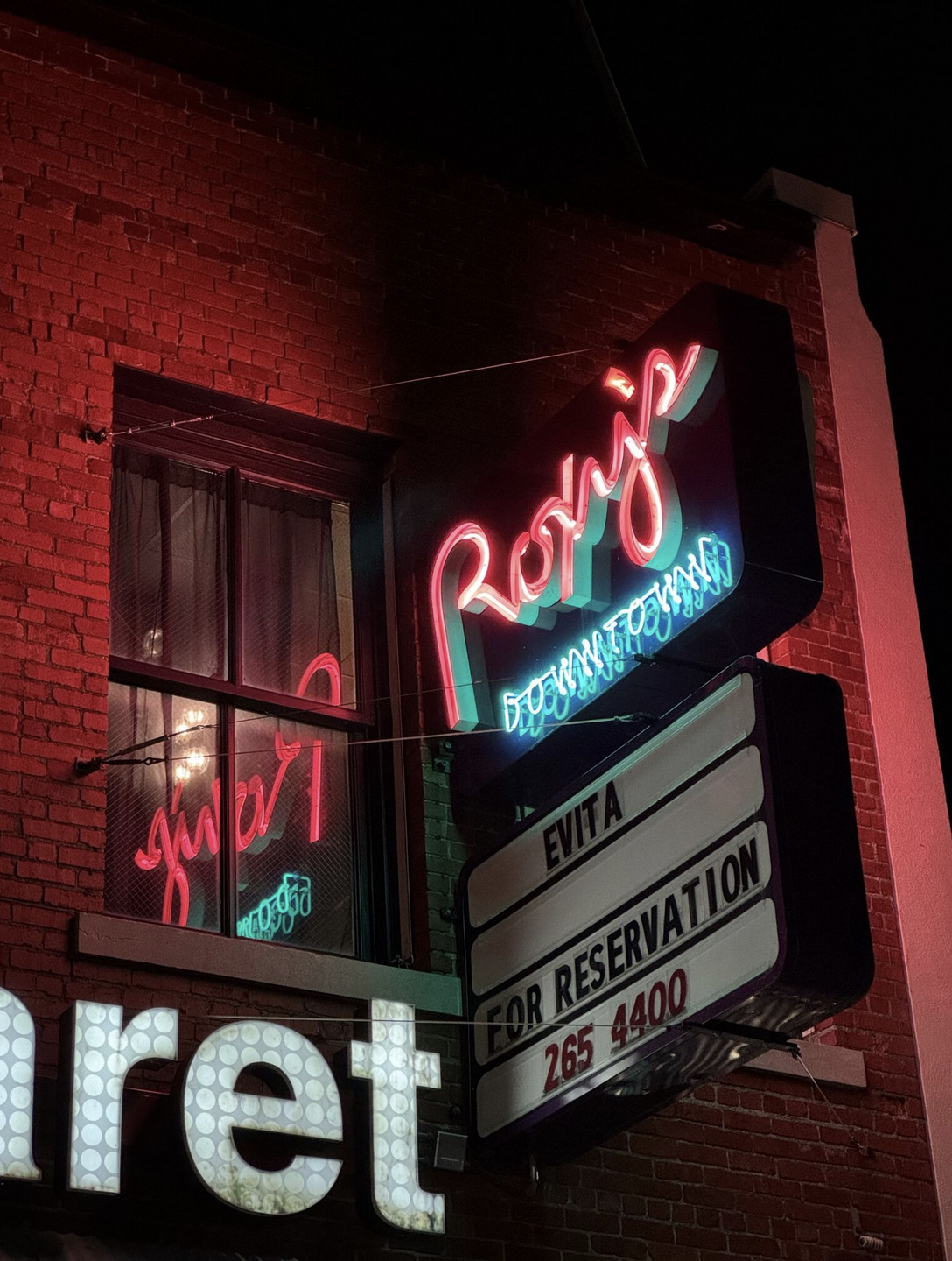
Nighttime letterforms … now those are a treat. When I first photographed the Roxy’s Downtown sign, I was drawn to the way it flickered at night, with its neon red and green reflecting and doubling the words across the window. It felt alive and performative, as if the sign itself were on stage.
One day, flipping through the book “Images of America: LGBTQ Wichita,” I found out that Roxy’s was one of the spaces where members of the LGBTQ community gathered in the mid- to late-20th century. It was a place where their stories were celebrated through play during challenging times of community visibility. Suddenly, the sign was no longer just a piece of glowing letterforms I had stumbled upon; it was another thread into community history — a marker of belonging and resilience.
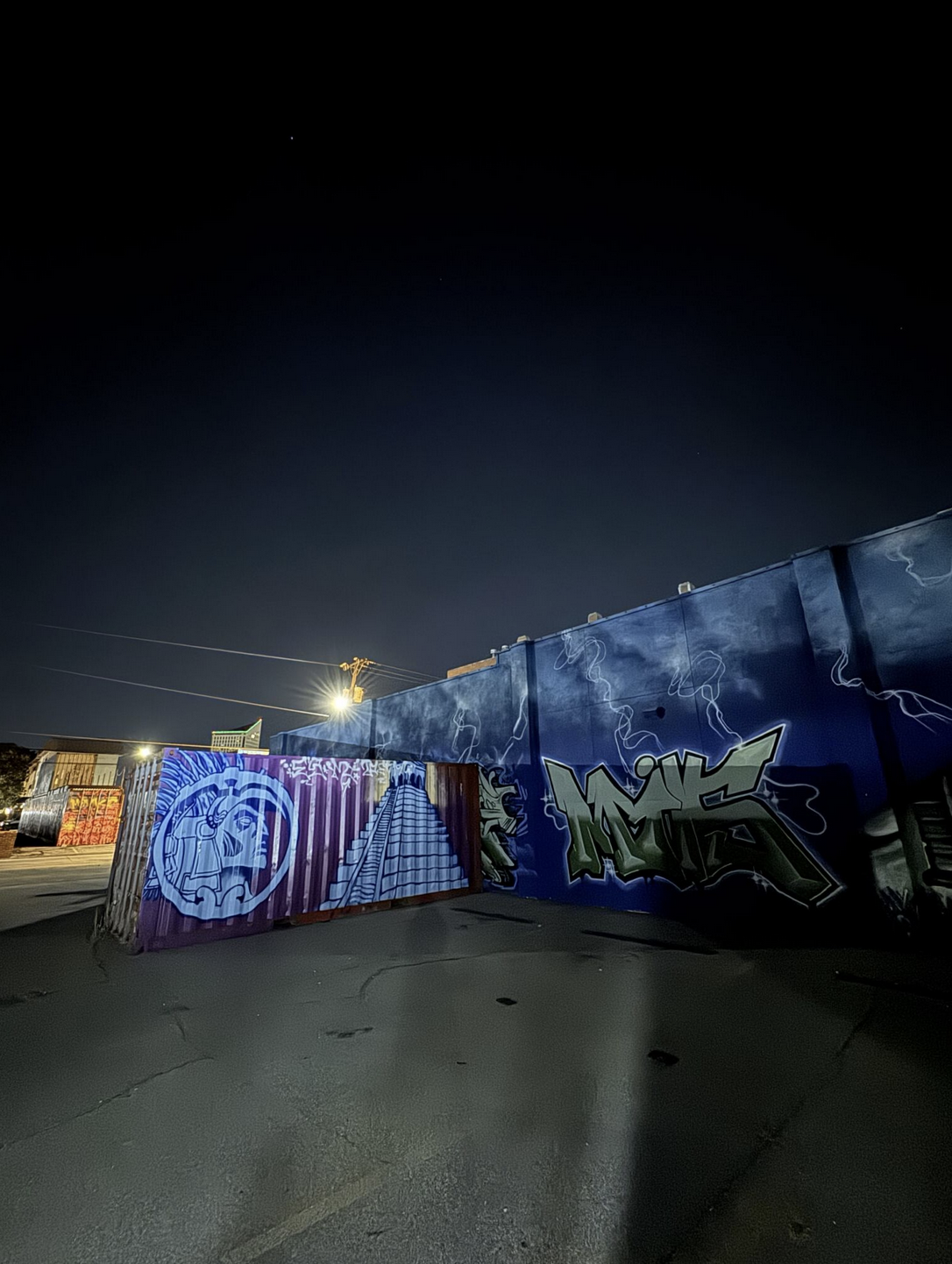
I often walk home after First Fridays — at least when Kansas weather behaves. Strolling one Friday night, I decided to take a detour to see the graffiti on the nearby shipping containers (part of the visual identity of Somewhere Fest), as I usually pass by them during the daytime.
In daylight, the colors are vibrant and the images are easy to read. At night, as I moved through the shadows, I could feel their creative energy passed on to me. The space is poorly lit, and you catch only glimpses. With my phone’s flashlight I traced across the letters, highlighting fragments one by one. Each sweep of light erased and remade the forms, as if I were drawing and redrawing in real time. For a moment, I wasn’t only a viewer — I felt like I was inside the act of making.
Walking reminds us to attend to things that usually go unnoticed.
Going for a walk with letterforms frames voids, absences, and overlooked fragments as central to the meaning of cities; it also invites speculation. You can see the city as it is, or you can imagine the city as it could be if you explore it in a different way. Finding your own pathway into the city’s elaborate web authored and influenced by diverse voices can mean the “difference between accepting what the world presents and noticing what matters to you,” as Rob Walker argues in “The Art of Noticing.”
Our free email newsletter is like having a friend who always knows what's happening
Get the scoop on Wichita’s arts & culture scene: events, news, artist opportunities, and more. Free, weekly & worth your while.
No spam. Unsubscribe anytime.
There are many more lettering compositions in Wichita’s urban landscape that I could tell you about, but some are better encountered on your own. What I’ll leave you with are a few places for you to visit and observe that can serve as starting points for your own urban walks. I haven’t described all of the pieces you’ll find. That part is yours. I invite you to walk and discover the letterforms as you stand in front of them. Notice how the light shifts, how your body tilts to see them, and how the city sounds around them. Pay attention.
As Susan Sontag asserts, “Attention is vitality. It connects you with others. It makes you eager. Stay eager.”
More locations to observe letterforms in Wichita
- 1116 E. Douglas Ave.
- 2207-2201 N. Park Place
- Commerce Street between Waterman and Kellogg Streets
- Gallery Allery, 616 E. Douglas Ave.
- Laura Street from Douglas Avenue to Kellogg Street
- 232 N. Market St.
Irma Puškarević is an educator, creative practitioner, and researcher whose work explores the entanglements of cultural heritage, language, pedagogy, and typography. Puškarević was born in Sarajevo, Bosnia and Herzegovina. She is an assistant professor and area head of graphic design for Wichita State's School of Art, Design and Creative Industries.
❋ Derby man has the kind of voice that turns heads — and chairs
❋ Socializing while sober: how some Wichitans are cultivating alcohol-free communities
❋ As a small creative business closes, the owner mourns
❋ Painting through it: Autumn Noire on 20 years of making art
❋ How a guy from Wichita resurrected 'Dawn of the Dead'
❋ Bygone Friends University museum housed curious collections
Support Kansas arts writing
The SHOUT is a Wichita-based independent newsroom focused on artists living and working in Kansas. We're partly supported by the generosity of our readers, and every dollar we receive goes directly into the pocket of a contributing writer, editor, or photographer. Click here to support our work with a tax-deductible donation.

